Increase Conversions on Your Payment Page
Your payment page is the moment of truth for each person who visits your website. The final chance for them to decide whether they want to remain just a visitor or become a paying customer. It is also one of the most critical factors in deciding whether your site and business will be successful. I work with leading merchants on many of the most successful sites, and this article is intended to help others understand how small positive changes to your payment pages can help you grow your revenue over time.
The people who reach your payment pages have already cost you quite a bit in many regards. They often arrive as paid traffic clicks or from many hours of your best SEO work coming to fruition. They burn bandwidth on your tour and are the ones you spent so much effort agonizing about while you were making font and color choices, the people you selected the best thumbnails to impress, and the reason you invested so heavily in securing your members' area from free sites. Now, they are finally at the point of sale, and convincing them to open up their wallet is what online business is all about.
It All Starts With Trust
Trust is the hurdle every sale must clear before it has any hope of being completed. If your site doesn’t look trustworthy, it is almost impossible to convert visitors into customers. Having a flawless user experience free of broken images and links, a clear and easy way for anyone to contact site support, a valid cancelation process and simply stated pricing all go a long way toward quickly establishing the level of trust needed to generate sales. Keep in mind, most people who reach your join page are deciding in less than thirty seconds whether it is safe to sign up or not, that means you need to establish your ethics in their minds intuitively and immediately.
Having a proper SSL certificate, including security seals from organizations like VeriSign, Trustee or WebsiteSecure, even things as simple as using a clear easy to read font can help your site generate the required amount of trust.
In years past, merchants used obscure wording to making pricing less obvious. These days you won’t see any of the top sites trying to get sales with a page that explains 30-day memberships cost 98 cents per day. Obvious, overt and easy to understand pricing information has proven to generate more revenue because it converts customers more easily.
A Taste Isn’t A Meal
The “free porn era” has brought many challenges to the paysite business model, and chief among them is the question of how much should be given away for free. Site owners struggle to decide if preview videos should be longer or shorter, and should they include the finale of the scene or end abruptly before it? How many trailers or photos are enough to generate a sale without being so much that they make the visitor feel there is no real reason to bother converting into becoming a customer?
Think of your join page and tour as a first date. If you let visitors have too much access they won’t bother wanting to pay for a second date, and if you hide too much they will end up dating someone else.
Tracking your on-page user metrics is a crucial element that many novices miss entirely. Most site owners track traffic buys and all of their off-page efforts to obtain visitors, but then they fail to track the on-page metrics of each visit. How long are your visitors spending on your site pages? How many trailers are they each watching on average? Do the ones who watch 2 trailers convert better or worse than the ones who watch 3 trailers? That’s the kind of analysis that will help you develop a data-driven sense of how much content you should make available. You you may find that multiple tours are needed, with different landing pages and join pages for various traffic sources as you continue to optimize your sales funnel.
Every site and audience is different, but tracking what your converted customers do and what your unproductive visitor traffic does differently is an essential part of designing a tour or join page to optimize revenue growth.
Mix Key Data & Emotions
Part of the problem with a join page conceptually is that it has to appeal to two very different thought processes to be successful. On the one hand, an adult site customer wants to know detailed data about the site. Like any shopper they want facts about the number of videos included, the update schedule, the models who appear behind the pay wall and more. On the other hand, that potential customer is probably reading all of that with his pants around his ankles.
If you were selling flatware or staplers you could get away with a dry set of factoids about the number of staples that fit in the magazine at one time. However, with entertainment, the data has to be matched with enough of an emotional connection to convince viewers to invest in seeing more. Join pages that skew too far toward plain statistics are no better than join pages that distract the user away from the signup process with sexy photos and no real sales pitch. Ideally, you want facts about your site and emotional cues to be paired together throughout the join process.
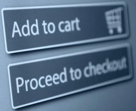
Always Focus On The Call To Action
The single biggest error we see on join pages when we review them is a failure to focus on the call to action. Yes, your pages need to feel credible, to be in full compliance with card association requirements, to include the right mix of marketing cues - but above all else, they must draw the viewer’s attention to taking action and completing the payment process.
Since your payment page is the last element of your sales funnel, it comes after all of your other marketing efforts are concluded. These are the people who have come to your site after your traffic budget was spent, the ones who have looked over your entire sales pitch and enjoyed the preview content you chose to make available. In effect, they have already gotten every cent and second you invest in acquiring a new customer, and now is the time to maximize their conversion chances from visitor to customer by effectively asking them to pay you to see more. Nobody will pay you if you fail to ask.
Highlighting the required form fields visually, making it as simple as possible to fill in their information, and expediting everything with as frictionless a payment process as possible is what your payment page must be about. MobiusPay works with many leading merchants and has over a decade of experience processing payments for sites like yours. We can provide many insights into what works best, and our experience proves optimizing your payment page is one of the most cost-effective ways to enhance your ROI. As always, MobiusPay is here to help you.
Return to Blog
* Created by